Filter by tag:

Posts tagged "Conversion"

Ultimate Guide to One-Click Checkout for Shopify

Ultimate Guide to One-Click Checkout for Shopify

70% of online shoppers abandon their carts. Why? Complicated checkout processes. One-click checkout, powered by tools like Shop Pay, simplifies this by letting customers complete purchases instantly using stored payment and shipping details.

Why It Matters:

  • Higher Conversions: Shop Pay boosts conversion rates by up to 50%.
  • Reduced Abandonment: 22% of shoppers quit because checkout takes too long.
  • Faster Checkout: Single-page forms and fast buttons speed up the process.
  • Mobile-Friendly: Perfect for the growing number of mobile shoppers.

Key Features:

  • Shop Pay: Increases checkout-to-order rates by 1.72x.
  • Single-Page Checkout: Faster and reduces friction.
  • Custom Branding: Aligns checkout design with your store’s look.
  • U.S. Adaptation: Handles local currency, addresses, and payment methods.

Quick Setup:

  1. Go to Settings > Payments in Shopify.
  2. Enable Shop Pay under Shopify Payments.
  3. Save changes and start converting more customers.

Takeaway: Simplifying your checkout process with one-click solutions like Shop Pay can recover up to 35% of lost sales and build customer loyalty. Start today and watch your revenue grow.

Shopify: How to Switch from a Three-Page to a One-Page Checkout

Key Features and Benefits of One-Click Checkout

One-click checkout simplifies the buying process by consolidating contact, shipping, and payment details onto a single page [3]. This streamlined method helps tackle a common problem in e-commerce: nearly 70% of shoppers abandoning their carts mid-purchase [6].

Fast Checkout Buttons

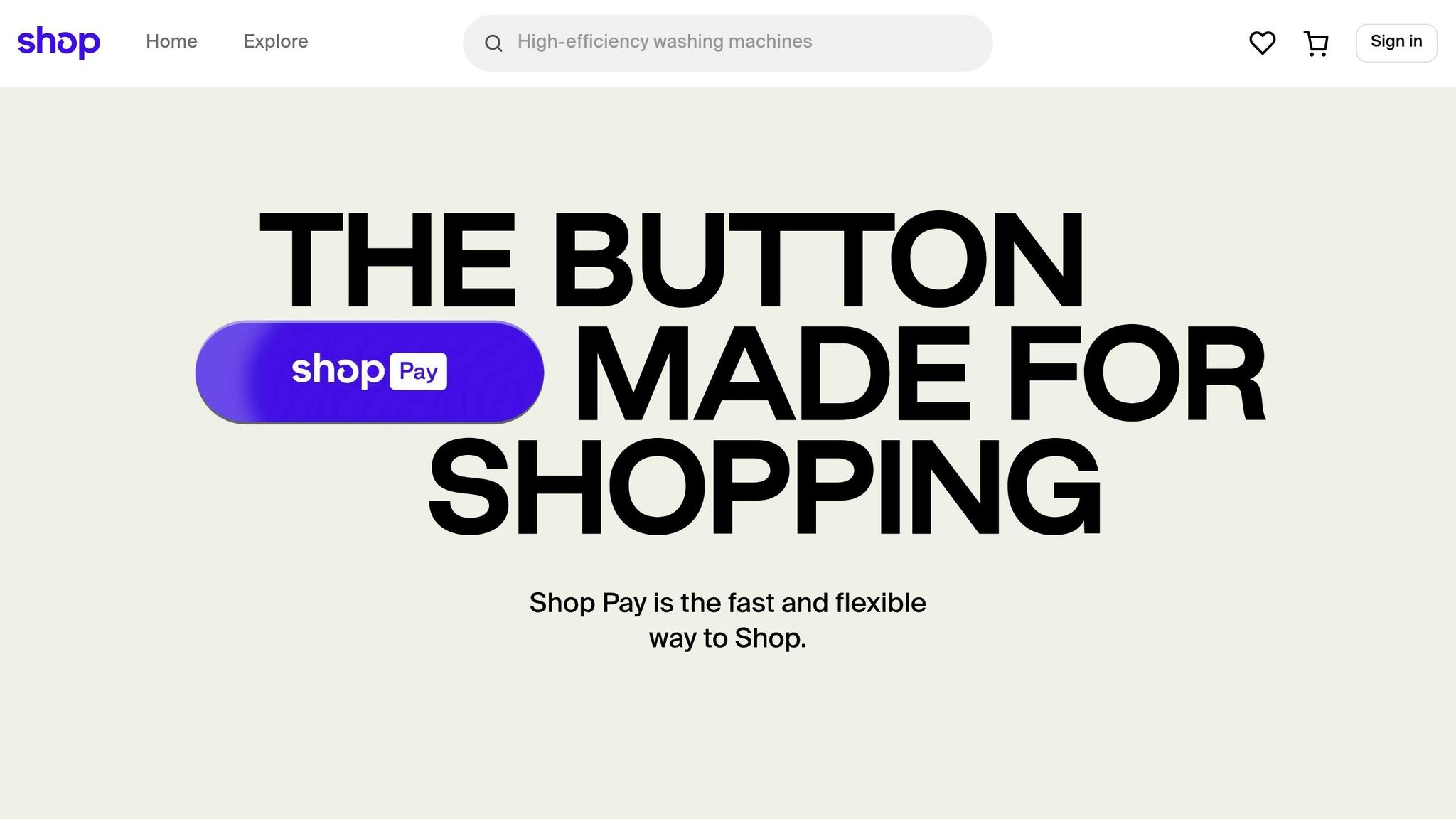
Fast checkout buttons, like Shop Pay, are at the heart of one-click functionality. These buttons allow customers to complete purchases instantly using their saved payment and shipping details. Positioned prominently, they eliminate the hassle of filling out forms.

The impact of these buttons is clear. In 2023, Shopify reported that merchants using Shop Pay achieved a 1.72x higher checkout-to-order rate compared to standard checkouts [4]. Shop Pay securely stores customer information and autofills it during transactions, speeding up the process.

For instance, a fitness brand using Shop Pay saw increased sales by offering localized options and customized checkout features [5]. Moreover, customers using the Shop App showed a 9.5% higher likelihood of making repeat purchases [5]. This demonstrates how fast checkout buttons not only improve initial conversions but also encourage long-term customer loyalty.

Beyond fast buttons, simplifying the checkout layout is another key step in creating a better shopping experience.

Single-Page Checkout Forms

Single-page checkout forms replace the traditional multi-step process by displaying all necessary fields - contact info, shipping address, payment details, and order summary - on one unified page. This makes it easier for customers to stay focused and complete their purchase without distractions.

Take Stellar Eats, a Canadian health food company, as an example. By adopting Shopify's one-page checkout, which pre-fills billing and shipping details for returning customers, they increased online conversions by 3.5% [5]. Similarly, Hemlock & Oak, a Canadian planner company, implemented the same feature and saw a 7% boost in online conversion rates [5].

Emma Kula, Co-Founder and Chief Product Officer at Stellar Eats, highlighted the advantages of this approach:

"One page checkout is a game changer for reducing friction - especially with shipping automatically calculated right in front of you" [7]

This streamlined design not only improves the checkout process but also pairs perfectly with custom branding to foster trust and loyalty.

Custom Design and Branding Options

Consistency in branding throughout the checkout process is essential for building trust and reinforcing a store's identity. Shopify offers merchants the ability to align their checkout design with their overall store aesthetic, ensuring a seamless transition from browsing to buying. Shopify Plus users gain access to advanced tools, such as a drag-and-drop editor, for more detailed checkout personalization [10]. The Branding API further enables merchants to tweak colors, fonts, and even add favicons, with these changes automatically applied to Shop Pay and checkout extensions [8].

Nunzio Ross, founder and CEO of Majesty Coffee, shared how these customization tools enhance the shopping experience:

"The better checkout personalization in Shopify Plus … allows us to refine our checkout interface to provide a more attractive, functional, and seamless experience for our purchasing customers, giving us insights into which layout designs are best for our clients. The improved selection of payment options also makes the checkout process highly convenient." [9]

John Hart, ecommerce manager at Peepers, emphasized how custom design builds trust:

"Custom checkout design builds customer trust by assuring them their personal and payment details are safe" [9]

Additionally, checkout UI extensions allow developers to add custom features that merchants can install at specific points in the checkout flow [10]. In February 2023, Shopify introduced updated checkout UI extension capabilities, making it easier for merchants to access and configure checkout apps directly from the Shopify App Store [10].

Setting Up One-Click Checkout on Shopify

Getting one-click checkout up and running on Shopify is straightforward. The key tool here is Shop Pay, Shopify's built-in solution designed for quick and seamless purchases. With over 40% of Shopify transactions completed through Shop Pay and conversion rates improving by as much as 18% [12], enabling this feature is a no-brainer for any merchant using Shopify Payments.

How to Enable Shop Pay in Shopify Payments

Shop Pay

Activating Shop Pay is quick and easy - it only takes a few steps in your Shopify admin. Best of all, it’s free and integrates effortlessly with Shopify Payments [1]. Here’s how to set it up:

Step Action
1 Go to Settings > Payments in your Shopify admin [11].
2 Under Shopify Payments, click Manage [11].
3 Check the box for Shop Pay [11].
4 Hit Save [11].

Once enabled, Shop Pay doesn’t just streamline your checkout process - it also unlocks two additional features: "Sell with Shop" and "Sign in with Shop" (available when your store meets the requirements) [11]. These features allow customers to find and shop your products directly through the Shop app, broadening your reach beyond your website.

The benefits are measurable. Stores using Shop Pay have seen conversion rates increase by up to 50% compared to guest checkouts [1]. Even just displaying the Shop Pay button can improve conversion rates in the lower funnel by 5% [1].

Sophie Gibson, co-founder of S'wheat, a sustainable kitchenware brand, highlights why they prioritize Shop Pay:

"We offer Shop Pay because it's quick, secure, seamless, and accepts all major card providers, so it makes things a lot easier for everyone. The majority of our transactions are through Shop Pay, actually, around 90%, with the other 10% or so through PayPal." [1]

Even if you rely on third-party gateways, you can still activate Shop Pay using the same steps [11].

Setting Up Checkout for U.S. Customers

After enabling Shop Pay, you can further tailor the checkout experience for U.S. shoppers. Customers in the U.S. tend to have specific expectations, such as properly formatted address fields and familiar language. Shop Pay automatically handles these details, recognizing U.S. shipping addresses and adjusting fields accordingly. This setup is also essential for offering features like Shop Pay Installments [12].

You can customize the checkout language to align with your brand's tone while still using terms that resonate with U.S. shoppers. These adjustments can be made directly in your Shopify admin once Shop Pay is enabled [12].

Another advantage of Shop Pay is its integration with the Shop app, where U.S. customers can track their orders post-purchase [1]. This added convenience keeps customers engaged and encourages repeat business.

Adding U.S. Payment Methods

To provide a checkout experience that meets U.S. preferences, it’s essential to offer the right payment methods. Digital wallets accounted for 50% of global eCommerce transaction value in 2023, with projections suggesting this will rise to 61% by 2027 [13]. In the U.S., credit and debit cards, along with digital wallets, dominate.

Credit and debit cards are non-negotiable. Over 70% of U.S. adults have at least one credit card, and more than 80% of those aged 15 and older own a debit card [13]. Shopify Payments supports all major card providers without additional transaction fees, unlike third-party gateways, which may charge fees ranging from 0.2% to 2% [13].

Digital wallets are increasingly important for a competitive checkout experience. When you enable Shopify Payments, Apple Pay and Google Pay are automatically activated alongside Shop Pay [13]. These wallets use Shopify’s dynamic checkout buttons to display the most relevant payment option based on the shopper’s device and preferences.

Buy Now, Pay Later (BNPL) options are also gaining popularity in the U.S. Shop Pay Installments, available for customers with U.S. shipping addresses, lets buyers split their purchases into smaller, manageable payments [12].

As FoxEcom puts it:

"As the leading payment method globally, both in eCommerce and at POS, digital wallet acceptance is mandatory for merchants in all consumer-facing verticals." [13]

While offering multiple payment options is essential, it’s equally important not to overwhelm your customers. Shopify’s dynamic checkout buttons ensure that only the most relevant payment methods are displayed [13]. This keeps the checkout process simple and intuitive for your shoppers.

How to Improve Your Checkout Experience

Once you've set up Shop Pay and your payment methods, the next step is to fine-tune your checkout process to boost conversions. A smooth, well-optimized checkout experience can make all the difference in turning browsers into buyers. Here's how to ensure your checkout process flows seamlessly and keeps customers engaged.

Matching Checkout Design to Your Brand

Your checkout page is the final touchpoint in the shopping journey, so it needs to feel like an extension of your brand. When customers move from browsing your products to completing their purchase, the transition should feel consistent and cohesive.

Shopify’s checkout editor and Branding API allow you to customize the checkout page to match your brand identity. Use consistent colors, fonts, and imagery that align with the rest of your website. Keep the design clean and simple - choose high-contrast colors for readability and avoid distracting visuals that pull attention away from the checkout process. Establish clear design guidelines for all elements, including headings, form fields, and typography, to maintain a unified look.

In addition to design, tools like popups can help streamline the checkout process and encourage conversions.

Popups, when used strategically, can be a powerful tool. About 60% of top Shopify stores incorporate popups, and they can achieve conversion rates exceeding 11% when done right [14][17]. Since half of U.S. shoppers are less likely to buy if checkout takes longer than 30 seconds [15], popups should focus on simplifying and speeding up the buying process.

Many brands have seen success with targeted popup strategies:

  • Diamond Candles uses a popup to offer a discount on the first purchase, encouraging visitors to join their email list [14].
  • Duchamp London displays a popup for carts under £150, aiming to increase the average order value [14].
  • Leesa deploys an exit-intent popup with a limited-time discount to reduce cart abandonment [14].

"Always make your visitors relate to the pop up you are displaying and offer something that will make them think twice or else they will just proceed abandoning your site – and possibly not come back!"
– John Komarek, eCommerce conversion specialist, Pixelter [14]

Another effective tactic is using direct checkout links, which skip the cart entirely and take customers straight to the checkout page. This is especially useful for single-product promotions or when customers are ready to buy immediately.

When designing popups, make sure they’re easy to close and don’t interrupt customers who are actively filling out forms. Personalize them based on browsing behavior or purchase history, and ensure they’re mobile-friendly for a seamless experience across devices [16].

Single-Page vs. Multi-Page Checkout Layouts

The layout of your checkout process plays a major role in conversion rates. Single-page checkouts are faster, taking about 53 seconds compared to 1:40 for multi-page checkouts [18]. This speed advantage can reduce cart abandonment by up to 44% [21].

Here’s a quick comparison:

Feature Single-Page Checkout Multi-Page Checkout
Speed Faster (53 seconds) Slower (1:40)
Cart Abandonment Lower (up to 44%) Higher
User Experience Streamlined, quicker Less cluttered, but slower
Customization Limited More flexible
Upselling Options Post-purchase only Pre- and post-purchase

For digital products, frequent shoppers, or low-cost items, a single-page checkout often works best. On the other hand, high-value purchases may benefit from a multi-page checkout, as it allows for more detailed information and reassurance during the process [18].

One store saw its conversion rate jump from 54% to 57% after switching to a single-page checkout [20]. However, as Christian Holst from Baymard notes:

"There do exist some A/B cases where one-page checkouts outperform multi-step checkouts significantly. However, these cases often compare a non-optimized multi-step checkout with a new optimized one-page checkout." [19]

Ultimately, the best approach is to A/B test both layouts to see what resonates with your audience. Factors like average order value, product complexity, and customer demographics should guide your decision. For many U.S.-based Shopify stores selling physical goods, single-page checkouts tend to deliver better results thanks to their simplicity and speed.

If you're looking for advanced customization or want to implement more complex conversion strategies, partnering with specialists like Optimizers can help you design and test checkout experiences tailored to your business goals. These strategies create a strong foundation for further optimization and compliance with broader best practices.

Best Practices and Compliance Requirements

Craft a one-click checkout experience that prioritizes trust, compliance, and smooth transactions. By focusing on conversion rates, accessibility, and data privacy, you can create a process that meets customer expectations while safeguarding your business.

How to Increase Conversion Rates

Building trust is key to improving conversions. Use elements like security badges, clear customer reviews, and visible return policies to reassure shoppers. Make your call-to-action buttons stand out with high-contrast colors and action-driven text, such as "Complete Purchase" instead of generic labels.

Provide clear and helpful error messages, like "Please enter a valid ZIP code" or "Your card number should be 16 digits", displayed near the relevant field. If your checkout involves multiple steps, include a progress indicator (e.g., "Step 2 of 3") to set clear expectations and reduce cart abandonment.

Next, ensure your checkout process is accessible to everyone.

Making Your Checkout Accessible

Accessibility is not just important - it’s essential. An estimated 1.85 billion people globally live with disabilities, representing a community with over $13 trillion in annual disposable income [22]. In the U.S., 82% of digital ADA lawsuits in 2023 targeted e-commerce companies [23]. These numbers highlight why inclusive design matters.

To make your checkout accessible:

  • Use descriptive <label> tags for all form fields.
  • Ensure keyboard navigation works seamlessly throughout the process.
  • Maintain a minimum text-background contrast ratio of 4.5:1 for standard text and 3:1 for larger text.
  • Include ARIA attributes to announce errors for screen readers, positioning error messages near the affected fields. Use both color and text to highlight issues.

For more advanced compliance, consider partnering with experts familiar with Shopify and ADA requirements. Companies like Optimizers offer services tailored to Shopify stores, ensuring your checkout is both inclusive and optimized for conversions.

Accessibility doesn’t just enhance usability - it also builds trust, especially when paired with strong privacy protections.

Keeping Customer Data Safe and Private

A secure checkout process is non-negotiable. Data privacy compliance is now a global expectation, with Gartner reporting that 75% of the world's population is covered by privacy laws [25]. For Shopify merchants, this means implementing strict data protection measures.

Laws like the California Consumer Privacy Act (CCPA) and the California Privacy Rights Act (CPRA) require businesses to clearly explain how customer data is collected, used, and shared. Non-compliance can lead to fines of up to $7,988 per willful violation [24].

Start with a clear and easy-to-understand privacy policy. It should outline what data you collect during checkout, how long it’s retained, and who it’s shared with. Make this policy easily accessible from your checkout page.

Offer transparent consent options. For example, if you sell or share customer data, include a prominent "Do Not Sell or Share My Personal Information" link that directs users to an opt-out page.

Limit data collection to what’s absolutely necessary for processing orders. Any additional fields should be optional and include an explanation of their purpose. Also, establish systems to handle customer requests for data access, deletion, or correction, with robust identity verification in place.

Regularly train your employees on data privacy and security practices to avoid accidental breaches. Implement tools like Global Privacy Control (GPC) signals to automatically respect customers' privacy preferences, as required by the CCPA.

While Shopify provides tools to help with compliance, the responsibility ultimately falls on you to configure your store correctly. Seeking professional advice can help you navigate complex privacy laws, ensuring both your customers and your business are protected.

Conclusion

One-click checkout is a game-changer for Shopify merchants looking to boost revenue. With cart abandonment rates sitting at around 70% [28][1] and 22% of those abandonments caused by overly complicated checkout processes [26], simplifying the checkout experience is more than just a nice-to-have - it's essential to staying competitive in e-commerce.

Shop Pay, for example, performs exceptionally well, converting 50% better than traditional checkout methods [27] and achieving 1.72 times higher checkout-to-order rates [1]. On top of that, optimizing your checkout process can help recover up to 35% of lost sales [26]. For a business generating $100,000 in monthly revenue, that’s an additional $35,000 you could be putting back into your pocket.

Rudra Kumar from Techmagnate highlights just how critical this is:

"Did you know that checkout optimization to one click checkout can restore as much as 35% of lost sales? And so for Shopify store owners, every second and every additional click at checkout counts. A complex or slow checkout experience can dramatically hurt your checkout conversion rate on Shopify, resulting in lost revenue opportunities. As online competition intensifies, simplifying the checkout process optimization is no longer a choice." [26]

The growing dominance of mobile commerce further amplifies the need for a seamless checkout experience. In 2022, over 65% of e-commerce retail sales came from mobile devices [2]. A one-click solution on mobile not only eliminates the hassle of entering lengthy details but also significantly reduces the likelihood of customers abandoning their carts. A fast, frustration-free mobile checkout doesn’t just improve conversions in the moment - it helps build customer loyalty over time.

When the checkout process is quick and effortless, customers are more likely to return, creating a ripple effect that drives long-term revenue growth [26]. Speed is crucial, but trust and accessibility are just as important in crafting a successful checkout experience.

Setting up one-click checkout - whether through Shop Pay or other tools - takes effort, from refining the design to ensuring trust indicators and data privacy are in place. But the payoff is clear: a smoother, faster checkout process leads to better conversions and fosters lasting customer relationships.

FAQs

How does Shop Pay’s one-click checkout boost conversion rates and reduce cart abandonment on Shopify?

Shop Pay’s one-click checkout streamlines the purchasing process, boosting conversion rates and cutting down on cart abandonment. By securely storing payment and shipping details, it enables customers to finalize their purchases with a single tap. This hassle-free approach removes barriers, making checkout quicker and more straightforward.

On top of that, Shop Pay offers installment payment options and includes trust signals that reassure shoppers. These features give customers both flexibility and peace of mind, making them more likely to complete their orders rather than leave items behind in their carts.

How can I make my one-click checkout process accessible and compliant with U.S. data privacy laws?

To make your one-click checkout process more inclusive and compliant with U.S. data privacy laws, start by implementing web accessibility best practices. This means enabling keyboard navigation, adding descriptive alt text to images, and ensuring that your site has enough color contrast. These elements help create a shopping experience that works for everyone, including individuals with disabilities.

On the data privacy front, focus on secure data handling and make sure your store has a clear and easy-to-understand privacy policy. Follow regulations like the ADA and Section 508, which mandate accessibility for digital content. Conduct regular audits of your store and collect user feedback to spot potential issues and stay on top of compliance requirements.

Can I customize my Shopify one-click checkout page to match my store's look and feel?

Shopify lets you tailor your one-click checkout page to match your store's branding effortlessly. You can tweak elements like your logo, colors, fonts, and background to ensure a smooth shopping experience that mirrors your brand's identity. For basic changes, Shopify's checkout editor provides all the tools you need. If you're looking for more in-depth customization, Shopify's Checkout Branding API offers advanced options to help you create a cohesive and polished look for your store.


Common Shopify Conversion Killers

Common Shopify Conversion Killers

Is your Shopify store losing sales? The average Shopify store converts just 1.4% of visitors, compared to 4.8% for top performers. The problem often isn’t your products - it’s hidden barriers that stop customers from buying. Here’s what could be hurting your conversions:

  • Slow page load times: Every extra second reduces conversions by 7%.
  • Poor mobile optimization: 81% of Shopify traffic is mobile, but bad mobile experiences drive users away.
  • Confusing navigation: Overloaded menus and unclear labels frustrate shoppers.
  • Weak product pages: Low-quality images, vague descriptions, and missing trust signals kill interest.
  • Complicated checkout processes: Hidden fees and long forms cause cart abandonment.

Fixing these issues can boost your sales significantly. For example, improving load times by 1 second can increase conversions by 2%, and optimizing checkout can recover up to 35% more sales. Let’s break down how to solve these problems step by step.

5 Strategies to Optimize Your Shopify Product Page for Maximum Conversions | CRO Insights Ep. 63

Slow Page Load Times

Did you know that every extra second a page takes to load can reduce conversions by 7%? [2] And if a page takes 3 seconds to load instead of 1, users are 32% more likely to leave [3]. Even more striking, 40% of shoppers will abandon a website if it takes longer than three seconds to load completely [5][6].

Mobile users face an even tougher challenge - mobile load times average 8.6 seconds, compared to just 2.5 seconds on desktop. A mere two-second delay can increase abandonment rates by a staggering 90% [4][7].

However, there's good news. Improving your page load time by just one second can increase conversions by 2% [9]. For instance, Deloitte found that even a 0.1-second speed improvement led to an 8.4% boost in conversions [8]. Molekule, a company specializing in air purifiers, achieved a 75% increase in device conversion rates and a 10% jump in overall traffic simply by improving their load times [4].

What Causes Slow Page Load Times

Several factors can drag down your Shopify store's speed. One of the biggest culprits? Unoptimized, high-resolution images. As Alex Mirzaian, marketing manager for Eightvape, puts it:

"When you're constantly creating content through blog posts or creating many products a day, you tend to just add images to the website without thinking. Compressing images can help a lot when you have thousands of images on the site." [10]

Another common issue is the overuse of third-party apps. Each app often adds JavaScript and CSS files, increasing the number of HTTP requests and slowing down your store. Similarly, heavy or poorly coded themes can include unnecessary animations, fonts, and scripts, while unminified JavaScript and CSS files add extra bloat. Other factors like excessive redirects and the absence of browser caching also contribute to sluggish load times.

Pinpointing these issues is the first step toward speeding things up.

How to Fix Slow Page Load Speed

Here’s how you can tackle slow load times effectively:

  • Optimize Images: Compress product images using tools like TinyPNG before uploading them. Convert images to WebP format to maintain quality while reducing file size. Enable lazy loading so images only load as users scroll.
  • Audit Apps: Regularly review installed apps and remove any that aren’t essential. Fewer apps mean less unnecessary code.
  • Choose a Lightweight Theme: Shopify’s Dawn theme is a great option designed for speed. If you’re using a custom theme, have a developer review it for inefficiencies.
  • Minify and Cache: Minify CSS and JavaScript files to reduce their size. Enable browser caching to avoid repeated downloads of the same resources.
  • Use a CDN: A Content Delivery Network (CDN) can serve images and other resources from servers closer to your customers, speeding up load times.
  • Limit Scripts: Only include essential scripts on necessary pages. Consolidate tracking codes and minimize redirects by ensuring internal links point directly to their final destinations.

Once you’ve addressed these issues, monitor your store’s performance using tools like Google PageSpeed Insights, GTmetrix, or Shopify’s built-in Online Store Speed report. Google recommends aiming for a page load speed of two seconds or less [10]. Additionally, a fast user experience is defined by an LCP (Largest Contentful Paint) score of under 2.5 seconds [4].

Faster load times don’t just improve user engagement - they also directly impact your bottom line. Optimizers offers dedicated site speed optimization services to eliminate bottlenecks and ensure your Shopify store delivers a smooth, fast experience for every visitor.

Poor Mobile Optimization

Mobile shopping has become the go-to method for online purchases in the U.S. In fact, over 70% of eCommerce traffic now comes from mobile devices [1]. By 2027, mobile commerce revenue is projected to hit $3.4 trillion, making up 63% of the total retail eCommerce market [17]. For Shopify stores, the numbers are even more striking - 81% of their traffic comes from mobile devices [14].

Despite mobile's dominance, many Shopify stores still fall short when it comes to mobile optimization. Mobile users tend to spend twice as much as desktop shoppers but are also twice as likely to leave if the site isn’t mobile-friendly [1]. And here’s the kicker: 57% of internet users say they wouldn’t recommend a business with a poorly designed mobile site [13].

Mobile optimization doesn’t just affect user experience - it plays a big role in search rankings. Google relies on mobile-first indexing, meaning your mobile site is what determines your position in search results [13][15]. So, if your mobile experience is lacking, it’s not just your customers who notice - Google does too.

Mobile Optimization Problems

Several common mobile-specific issues can severely hurt your conversion rates. One of the biggest culprits? Non-responsive layouts. If your store doesn’t adjust to different screen sizes, customers will struggle to navigate, read, or make purchases.

Another issue is tiny touch targets. Many Shopify stores have buttons, links, or form fields that are too small to tap comfortably. Considering that 69% of users interact with mobile devices using their thumbs [12], your clickable elements need to be large enough for easy one-handed use.

Intrusive pop-ups are another headache. On mobile, these overlays can block key parts of the screen, making it hard for users to close them or continue browsing.

Speed is another dealbreaker. Slow-loading mobile sites contribute to high abandonment rates, with mobile eCommerce facing a staggering 85.65% cart abandonment rate [14].

Navigation also tends to be a pain point. Menus designed for desktop screens often don’t translate well to mobile, leaving users frustrated when they can’t find what they’re looking for. Since 78% of users prefer navigation that stays visible as they scroll [12], hidden or poorly designed menus can create a major usability issue.

How to Fix Mobile Optimization

The good news? These problems are fixable with the right approach. Start by using a mobile-responsive theme, such as Shopify’s Dawn theme. Shopify also offers a theme preview feature, so you can see how your store looks on mobile, tablet, and desktop screens [15].

Make sure clickable elements are at least 48×48 pixels [11], and use contrasting colors for buttons to make them easy to tap. Streamline navigation with collapsible menus and sticky headers. Keep the main menu simple, and use dropdowns to organize categories. A fixed navigation bar ensures users can quickly access key links without scrolling back to the top [12].

Place important content above the fold to grab attention right away. Simplify your checkout process by reducing form fields to only the essentials, enabling autofill, and offering mobile-friendly payment options like Apple Pay and Google Pay [13]. Keep in mind that 22% of U.S. shoppers abandon their cart because the checkout process is too long or complicated [13].

Adjust your typography for better readability. Use a minimum font size of 16 pixels so users don’t have to zoom in [13]. This small tweak can make a big difference.

If you must use pop-ups, keep them subtle. Opt for slide-ups from the bottom of the screen rather than full-screen overlays, and use delay timers so they don’t appear immediately [13].

Testing is key. Use tools like Google’s Mobile-Friendly Test and Search Console to identify problem areas [15][14]. Don’t stop there - test your site on actual smartphones and tablets to understand the experience from your customers’ perspective.

Monitor mobile performance using Google Analytics. Set device type as a secondary dimension and track metrics like bounce rate, load time, and conversion rate specifically for mobile visitors [14].

"Prioritize enhancing the real user experience on mobile devices. Optimizing for smooth scrolling, quick site responsiveness, and excellent usability (ensuring good contrast, for example) will have a more direct impact on engaging customers and succeeding in the mobile marketplace." – LitExtension [16]

Mobile optimization isn’t a one-and-done task. It requires continuous attention to keep up with user expectations and technological changes. For Shopify store owners, focusing on mobile UX design can transform casual visitors into loyal customers. Once your mobile performance is solid, the next step is refining your site’s navigation to ensure a seamless user journey.

Confusing Navigation

After improving mobile optimization, the next big hurdle is simplifying your site's navigation. Think of navigation as the map your customers use to explore your store. If it’s messy or confusing, they’re likely to leave. A cluttered or poorly organized menu can quickly lead to frustration, ultimately causing abandoned carts [18].

This isn’t just a minor inconvenience - it’s a direct hit to your sales. When shoppers struggle to find what they’re looking for, they’re far more likely to abandon their session altogether. With the average online shopping cart abandonment rate sitting at 70.19% [19], you can’t afford to overlook this. The stakes are even higher on mobile devices, which account for over 70% of eCommerce traffic [18]. Mobile users demand navigation that’s simple, intuitive, and touch-friendly.

Certain navigation issues can seriously hurt your conversion rates. For instance:

  • Overloaded menus: Too many options can overwhelm visitors, creating decision paralysis. In fact, 52% of desktop sites struggle to strike the right balance between variety and simplicity [20].
  • Unclear labels: Using jargon or ambiguous terms in your menu can confuse customers, making it harder for them to find what they need.
  • Hidden or poorly designed search bars: This is a missed opportunity, especially since shoppers who use the search bar are twice as likely to make a purchase [21].
  • Deep menu structures: Menus with too many layers can frustrate users and disrupt their mental flow.
  • Inconsistent navigation: When navigation changes from page to page, it makes the shopping experience feel disjointed.

How to Improve Navigation

Start by simplifying your main menu. Limit it to no more than seven items, focusing on your most popular or profitable categories. Make sure every page features a prominent search bar with autocomplete and error tolerance - it’s a small change that can make a big difference.

Use clear, straightforward labels that tell users exactly what to expect. Avoid jargon or overly creative names that could confuse shoppers. For mobile users, implement a hamburger menu that’s easy to access and includes touch-friendly elements. Sticky navigation bars can also be a game-changer, keeping important links visible as customers scroll.

Breadcrumbs are another helpful addition, especially on product pages, as they show users exactly where they are in your store. When organizing categories, think like your customers - not your internal inventory team. Arrange items in a way that feels logical and intuitive to them.

Responsive design is a must. Your navigation should adapt seamlessly to any screen size, ensuring a smooth experience whether someone’s shopping on a phone, tablet, or desktop.

To fine-tune your navigation, use tools like Google Analytics to track user behavior. Look at user flow reports to identify where customers are getting stuck. A/B testing different menu structures or labels can also provide valuable insights.

"The words that you pick and the order that you put them in for the top navigation really can have a significant impact on all visitors." – Brian Massey, The Conversion Scientist [20]

Finally, keep your navigation fresh. Update it quarterly to reflect new products or remove outdated ones. For Shopify store owners, partnering with UX professionals can be a smart move. Services like Optimizers’ UX audits can help identify specific navigation problems and offer tailored solutions.

Next, we’ll dive into how poorly designed product pages can further hurt your conversion rates.

Weak Product Pages

Once you've simplified your store's navigation, it's time to turn your attention to product pages - the heart of your online store. These pages are your virtual sales floor, and they play a pivotal role in turning browsing into buying.

The importance of product pages can't be overstated. 85% of shoppers say that product information and images are key factors when deciding between brands [23]. Yet, many Shopify stores fall short with product pages that fail to inspire confidence or provide the necessary details customers need to make informed decisions. Improving these pages is essential to converting interest into revenue.

"The paramount goal for your product pages should be to build user confidence by providing all the information necessary for a purchasing decision and making the process as intuitive and straightforward as possible." - Rosara Joseph, Content Strategist, VentureWeb [23]

Common Product Page Pitfalls

Several mistakes can sabotage your product pages and, ultimately, your sales. The most glaring issue? Low-quality or insufficient images. Since customers can't physically interact with your products, images are their primary way to assess what you're offering. Blurry photos, limited angles, or images that fail to highlight key features leave potential buyers uncertain.

Another frequent misstep is relying on vague or overly generic product descriptions. When descriptions focus too much on technical jargon or are too brief to answer basic questions, shoppers lose interest. Copy-pasting manufacturer descriptions instead of crafting customer-focused content is another mistake that can alienate your audience.

Lack of trust signals is another major sales killer. With over 95% of shoppers checking reviews before making a purchase and nearly 75% refusing to buy products without reviews [24], failing to include ratings or customer feedback can make your product pages feel unreliable.

Then there’s the issue of slow-loading pages. Speed matters - a lot. 57% of consumers will abandon a Shopify site if it takes more than three seconds to load [22]. When shoppers are already weighing whether to trust your store, a sluggish page can be the dealbreaker.

Finally, ensure your product pages are mobile-friendly. A poor display on smaller screens can create unnecessary friction and drive potential buyers away.

Creating Product Pages That Convert

To build product pages that boost sales, start with high-quality, high-resolution images. Show your products from multiple angles and enable zoom features so customers can examine details. Make sure each product variant has its own set of linked images, allowing buyers to see exactly what they’re getting.

Next, focus on writing engaging, benefit-driven product descriptions. Don’t just list features - explain how those features solve problems or improve your customers' lives. Use clear, conversational language that aligns with your brand's personality.

"Descriptions don't have to be bland. Invest the time and energy to address customer needs. You have about .02 seconds to make an impression on them, so make it a lasting one by owning your voice!" - Maria Bonello, Director of Strategy, SMAKK Studios [23]

Customer reviews are a must. Display them prominently on every product page, and encourage reviews by following up with customers after purchases. If you’re just starting out, reach out to early buyers for feedback or offer small incentives for honest reviews.

Ensure your pages are optimized for mobile. Use responsive themes and test your pages on various devices to catch any issues before your customers do. A seamless mobile experience is critical for maintaining trust.

To reduce cart abandonment, offer a variety of payment options. Around 7% of shoppers abandon their carts due to limited payment methods [22]. Include popular choices like PayPal, Apple Pay, and Google Pay alongside traditional credit card options.

Build trust by adding security badges and trust icons near your add-to-cart buttons. Clearly display return policies, shipping details, and contact information to reassure buyers they’re making a safe purchase.

Finally, include an FAQ section on your product pages. Addressing common questions upfront helps reduce hesitation and minimizes the need for back-and-forth with customer service.

If you’re looking for expert help, professional product page optimization services can take your Shopify store to the next level. These services focus on creating pages that not only look great but also build trust and drive conversions effectively.

Next, we’ll dive into improving the checkout process.

Complicated Checkout Process

Once you've fine-tuned your product pages, the next big challenge is ensuring your checkout process doesn't trip up potential buyers. This is where many Shopify stores lose customers. According to the Baymard Institute, a staggering $260 billion in lost orders could be recovered in the US and EU simply by improving checkout flows and design[25].

Most shoppers expect to complete their checkout in under four minutes. Any delay or obstacle during this critical stage can result in immediate cart abandonment. Let’s break down the common issues that drive customers away during checkout.

Checkout Problems That Lose Customers

Several recurring mistakes in the checkout process are responsible for lost sales. The biggest offender? Surprise fees. Nearly half of shoppers (48%) abandon their carts when unexpected costs - like shipping or taxes - appear late in the process[25]. Imagine thinking you're paying $50 for an item, only to find out it’s $65 at checkout. That’s a quick way to lose trust.

Another major issue is forcing account creation, which deters 26% of shoppers[26]. Trust concerns also play a role, with 25% of buyers leaving due to unclear security measures or unfamiliar payment methods[26].

Then there’s the checkout design itself. Long, multi-page processes with too many fields or unclear progress indicators frustrate customers who just want a simple, fast transaction.

Reason for Abandonment Percentage
Extra costs (shipping, taxes) 48%
Required account creation 26%
Credit card security concerns 25%
Slow delivery 23%
Complex checkout 22%
Hidden total costs 21%
Unsatisfactory returns 18%
Website errors 17%
Limited payment options 13%
Card declines 9%

For mobile users, these problems are even worse. A clunky mobile checkout experience can frustrate buyers and lead to even higher abandonment rates.

The good news? Each of these issues has a straightforward solution.

How to Fix Your Checkout Process

Addressing these problems can lead to a massive boost in conversions. In fact, large ecommerce stores can see a 35% increase in conversion rates by improving their checkout design[27].

Here’s how to tackle the most common issues:

  • Enable Guest Checkout: Forcing account creation is a major turnoff. Let customers check out as guests, and collect their information after the purchase.
  • Be Transparent About Fees: Show all costs upfront to avoid sticker shock. Hidden fees are a quick way to break trust.

"When customers know that they can get their money back just as easily as they can spend it, they'll shop more confidently and spend more." – Sanaz Hajizadeh, former director of product management at Happy Returns[25]

  • Simplify the Checkout Process: Cut down on unnecessary steps and fields. A single-page checkout can often work wonders. If you must use multiple steps, add a progress bar to show buyers exactly where they are in the process.

"Progress bars help customers navigate multi-step checkouts by showing current position and remaining steps, reducing uncertainty and cart abandonment rates." – Evaldas Mockus, VP of Growth at Omnisend[28]

  • Offer Flexible Payment Options: Make it easy for customers to pay by including options like credit cards, PayPal, Apple Pay, Google Pay, and more. Shop Pay, for example, has a checkout-to-order rate 1.72 times higher than standard checkouts and performs even better on mobile[27].
  • Build Trust: Display security badges, SSL certificates, and money-back guarantees prominently. These reassure shoppers that their information is safe.
  • Optimize for Mobile: Ensure your checkout works seamlessly on smartphones and tablets. Use large, tappable buttons, clear text, and responsive design. Test your checkout process on multiple devices to catch any issues.
  • Use Exit-Intent Popups: These popups can recover up to 13.5% of abandoned carts[26]. They might offer discounts, remind customers of their items, or address common concerns before they leave.

Finally, consider working with experts like Optimizers, who specialize in checkout optimization and ADA compliance. They can help ensure your checkout process is not only smoother but also accessible to all customers.

Conclusion

Slow-loading pages, clunky mobile layouts, confusing navigation, weak product pages, and a checkout process that feels like a maze - these are all factors that can seriously impact your Shopify store's ability to convert visitors into buyers. The upside? Each of these challenges has proven fixes that can significantly boost your store's performance.

Improving your store isn’t a one-and-done task. With the average Shopify store converting at just 1.4% while top-performing stores achieve much higher rates [32], a consistent focus on testing and refining can yield real results. Dive into metrics like Average Order Value (AOV), Customer Lifetime Value (CLV), and bounce rate to uncover patterns in how customers interact with your store [29]. Prioritize impactful changes, and test one adjustment at a time to clearly measure its effects [29]. These small, targeted tweaks can make a big difference over time.

Taking a structured approach pays off. For instance, stores with optimized checkout processes see a 35% higher conversion rate [31], mobile-friendly designs can increase conversions by 40% [30], and shaving just one second off page load times can lead to noticeable improvements [29].

For Shopify stores in the U.S., working with Optimizers can be a game-changer. Their expertise in conversion rate optimization, performance upgrades, and ADA compliance ensures your store is primed for success.

Tackling these common conversion blockers one by one sets your store up for long-term growth. By systematically addressing each issue, you’re paving the way for stronger sales and a more loyal customer base.

FAQs

How can I tell if my Shopify store is loading too slowly, and what tools can help me measure it?

If your Shopify store takes too long to load, it can negatively impact both your conversion rates and the overall shopping experience. To assess your store's performance, try using tools like Google PageSpeed Insights, GTmetrix, or Shopify's built-in speed reports. These tools provide insights into critical metrics like Largest Contentful Paint (LCP) and total load time, helping you spot areas that need improvement.

After identifying the problem areas, you can make adjustments like compressing images, removing unnecessary scripts, or enhancing server response times. Keeping an eye on your store's speed regularly helps create a smoother and more enjoyable experience for your customers.

How can I optimize my Shopify store for mobile users to create a smooth and enjoyable shopping experience?

To make your Shopify store mobile-friendly, prioritize simple and user-friendly navigation. Adding a sticky navigation bar can make it easier for shoppers to access menus and essential features with a single tap. Also, optimize your images by compressing them to minimize load times and avoid layout shifts, which can disrupt the browsing experience.

Focus on designing call-to-action (CTA) buttons that stand out and are easy to tap. Adjust font sizes to ensure readability on smaller screens, and steer clear of intrusive pop-ups that might annoy visitors. These tweaks can enhance the shopping experience, boost conversions, and leave customers feeling satisfied.

What are the best ways to simplify the checkout process on my Shopify store to reduce cart abandonment?

To make the checkout process smoother and cut down on cart abandonment, focus on reducing unnecessary steps. Allow customers to use a guest checkout option so they can complete their purchase without needing to set up an account. Keep forms simple by minimizing the number of fields and pages they need to go through.

It's also crucial to offer a variety of payment options like credit cards, PayPal, and digital wallets to cater to different preferences. Build customer confidence by showcasing secure checkout badges and using SSL encryption to protect their data. These adjustments not only speed up the checkout process but also make it more user-friendly, helping to boost conversions and lower frustration levels.


Top Conversion Tips to Improve your Product Page

Top Conversion Tips to Improve your Product Page

Your product page is the key to turning visitors into customers. Here’s how to make it work:

  • Write better product descriptions: Focus on benefits, not just features. Use clear U.S. formatting (like pounds, ounces, and Fahrenheit) to make details easy to understand.
  • Use high-quality images and videos: Show your product from multiple angles, include lifestyle shots, and add videos to help shoppers visualize and trust your product.
  • Add trust signals: Display customer reviews, ratings, and trust badges (like secure checkout or free returns) to build confidence.
  • Improve call-to-action (CTA) buttons: Use clear, action-oriented text (e.g., "Buy Now") and place buttons where they’re easy to see and click, especially on mobile.

By optimizing these elements, you’ll reduce cart abandonment, increase conversions, and make your product page a powerful sales tool.

Ready to dive in? Let’s break it down step-by-step.

I analyzed 983 Shopify product pages, This is What Works!

Write Better Product Descriptions

Your product description isn't just text - it's your chance to turn casual browsers into committed buyers. With 87% of consumers saying product content is extremely or very important when deciding to purchase [3], nailing this part of your sales strategy is critical. In fact, in 2022, 56% of online purchases in the U.S. were returned because the product didn’t match its description [2].

If your descriptions are just lists of features, it’s time to rethink your approach. People buy based on emotions and then justify their decisions with logic. Your descriptions should spark both. And don’t overlook the importance of using familiar U.S. standards to make your content instantly relatable to your audience.

Use U.S. Formatting Standards

American shoppers expect details that feel familiar and easy to digest. That means using imperial measurements, U.S. currency formatting (e.g., $49.99), and American spelling (e.g., color, organize). These small choices eliminate unnecessary friction, like forcing customers to mentally convert units or decipher unfamiliar terms.

For example:

  • Use pounds and ounces for weight, not kilograms.
  • State temperatures in Fahrenheit: "keeps drinks cold at 35°F" is clearer than its Celsius equivalent.

These formatting decisions aren’t just about convenience - they build trust. When your product details align with what shoppers are used to, they feel more confident about making a purchase.

Highlight Benefits Over Features

Features tell, but benefits sell [2]. Instead of stopping at what a product has, explain what it does for the customer - and why it matters to them. This approach taps into emotional drivers like comfort, happiness, or peace of mind.

Here’s an example of the difference:

  • Feature-focused: "This standing desk is made of durable oak and has an adjustable height ranging from 28 to 48 inches."
  • Benefit-focused: "Boost your energy and reduce back pain with this adjustable standing desk. Effortlessly switch between sitting and standing to improve your posture and productivity - all while adding a stylish touch to your workspace." [2]

The second version doesn’t just describe the product; it paints a picture of how it improves the buyer’s life. It also uses vivid, relatable language to help shoppers imagine themselves using it.

For a winning structure, combine an engaging paragraph with bullet points that list key specs [2]. Start with a paragraph that emphasizes the main benefit, then use bullet points to provide the technical details that logical buyers need to justify their emotional decision.

If your product tends to raise specific concerns, address them proactively. For instance:

  • If size is a common question, mention: "Compact design fits any workspace."
  • For durability concerns, emphasize: "Crafted with premium materials to last for years."

Speak directly to your customer using “you” language, focusing on the results they’ll experience. For example: “You’ll love how this compact blender makes your mornings easier.”

Finally, keep in mind that search engines now prioritize conversational, specific queries. Writing naturally for your audience not only connects with them but also helps your SEO. The goal? Make shoppers feel confident they’ve found the perfect solution to their problem.

Add High-Quality Images and Videos

Great visuals are more than just a nice touch - they can make or break a sale. When customers shop online, they can't physically examine your products, so high-quality images and videos become their eyes and hands. According to the Baymard Institute, 25% of online stores lose sales because their visuals are too poor to let shoppers properly evaluate products [4].

The stats back this up: 88% of shoppers say videos help them understand products better, 90% are more likely to buy after watching a product video, and 79% make a purchase after seeing a branded social media video [6]. These aren't just extras - they're essential tools that directly affect your sales.

Show Multiple Angles with Zoom Options

Think about how you shop in a store - you pick up an item, turn it over, and inspect it closely. Online shoppers want the same experience. That’s why offering multiple angles and zoom functionality is so important. It gives customers the detailed view they need to feel confident about their purchase.

Shopify makes this easy by allowing you to upload several images per product. Use this feature to give shoppers a complete view: show the front, back, sides, top, and bottom. For products with important details - like texture, stitching, or small components - include close-up shots.

Zoom functionality is a game-changer, especially for items like clothing, jewelry, or electronics where fine details matter [11]. Shopify apps like Magic Zoom Plus or Magic 360 take it a step further by offering 360-degree views, letting users rotate products and examine them from every angle [10]. These interactive features make it easier for customers to fully understand what they’re buying.

Don’t forget the technical side. Shopify recommends using 2048 x 2048 pixels for square images to ensure clarity, and enabling lazy loading can help improve site performance [4][5][10].

While detailed shots highlight the product itself, lifestyle visuals show how it fits into your customers’ lives.

Include Lifestyle Images and Videos

Standard product shots on white backgrounds are important, but they only tell part of the story. Lifestyle images and videos go further, showing your product in action and connecting emotionally with your audience.

These visuals work because they demonstrate how your product enhances everyday life. A coffee mug becomes a cozy morning ritual. A laptop bag transforms into the perfect travel companion. A fitness tracker becomes part of a healthier, more active lifestyle. These moments help customers see not just the product, but the experience it creates [7].

The benefits are clear: videos can increase conversion rates by 30%, extend average session time by 45%, and lower bounce rates by 20% [8]. They also reduce hesitation by giving customers a better sense of a product’s size, texture, and functionality [8].

Scicon Sports is a great example of this strategy. Their Global Brand Manager highlights the power of user-generated content (UGC):

"For Scicon Sports, UGC has been invaluable in showing a broader range of images of athletes and customers using our sunglasses, beyond what we capture in photoshoots. Featuring real customer photos and social media posts provides potential buyers with social proof and inspiration." [7]

Lifestyle photos and videos humanize your products, making them relatable and trustworthy [9]. They also act as social proof - when people see others enjoying your product, it boosts their confidence in making a purchase.

User-generated content is an excellent way to add authenticity. Encourage customers to share photos of your product in use, whether it’s fresh out of the box or after years of wear. This not only gives you genuine content but also builds a sense of community and loyalty around your brand [7].

When creating lifestyle content, focus on the experiences your product enables. Even technical items can be made appealing by tying them to dreams, adventures, or meaningful moments [7]. The goal isn’t just to show what your product does - it’s to show how it makes life better.

Add Trust Signals

Once your visuals are polished, it's time to strengthen buyer confidence with trust signals. These are essential for reassuring online shoppers about your store's legitimacy and the quality of your products. While visuals draw buyers in, trust signals help eliminate doubts and encourage conversions. Consider this: 88% of consumers trust online reviews, and 45% avoid products without them [12][14]. Trust signals address concerns like, "Is this product worth it?", "Will my payment details be safe?", and "What if I’m not satisfied?"

Show Customer Reviews and Ratings

Customer reviews act as powerful social proof, showing that real people have bought and enjoyed your products. Did you know that products with reviews convert 3.5 times better than those without? And among consumers aged 18 to 34, 91% trust online reviews as much as personal recommendations [15].

To maximize their impact, make reviews highly visible. Place star ratings near product titles and close to purchase buttons - right where shoppers make decisions [15]. Highlight the most useful reviews by allowing customers to vote on or filter feedback. This way, potential buyers can quickly find insights about things like sizing, quality, or performance.

The numbers don’t lie: products with just five reviews are 270% more likely to be purchased compared to those with no reviews [14][15].

"Customer reviews are therefore a powerful vector of trust for your Shopify store. They prove your reliability through the experiences of other buyers and reduce hesitations."
– Avis vérifiés [15]

Engage with your reviews by responding to both positive and negative feedback. Avoid deleting or altering negative reviews - it’s better to show transparency, which builds trust [13].

Display Trust Badges

Trust badges are small but impactful icons that reassure shoppers and increase conversion rates. They work by associating your store with trusted brands and security standards.

For example:

  • Security badges like SSL certificates and secure checkout icons show buyers their data is safe.
  • Payment badges featuring logos of Visa, Mastercard, American Express, or PayPal connect your store with respected and familiar names [16][17].
  • Policy badges address common hesitations: free shipping icons emphasize cost savings, money-back guarantee seals promise refunds, and free return badges reduce purchase risks.
  • Endorsement badges from organizations like the Better Business Bureau add an extra layer of credibility.

"Trust badges are a huge asset in retaining new visitors to your site. They've also been shown to increase sales and reduce cart abandonment."
– Belma V., Marketing Associate, HulkApps [16]

Use these badges wisely. Stick to recognizable names like PayPal or Visa, as they inspire instant trust [18]. Experiment with badge placement - near the add-to-cart button, during checkout, or in the footer - to see what works best for your audience [18]. The key is to integrate them seamlessly, creating a smooth shopping experience while reinforcing trust at every step.

Improve Call-to-Action Buttons

Your call-to-action (CTA) buttons are more than just website design elements - they’re the final push that turns casual browsers into paying customers. After building trust with reviews and badges, these buttons need to guide shoppers toward completing their purchase.

"A well-written and well-designed call to action can reduce a prospective customer's decision fatigue by giving them a clear next step toward a specific action you want them to take." - Shopify Staff [19]

Here’s the thing: visitors form opinions about your site in just 50 milliseconds, and 94% of those first impressions are tied to design [20][22]. That means your CTA buttons need to stand out and function flawlessly from the moment someone lands on your page.

Write Clear Button Text

The words on your buttons matter - a lot. Avoid generic phrases like "Click Here" or "Submit." Instead, use action-oriented language that clearly communicates what happens next.

For example, phrases like "Add to Cart", "Buy Now", "Shop Now," or "Get Yours Today" work well on product pages. If you’re running a limited-time offer, create urgency with options like "Buy Now – Limited Time" or "Add to Cart – Sale Ends Soon."

Personalized CTAs can also make a huge difference, performing 202% better than generic ones [25]. Tailor your text to fit your audience and product. For higher-priced items, softer options like "Learn More" or "Get Details" might resonate better. On the other hand, impulse purchases thrive on direct, immediate CTAs like "Order Today" or "Buy Now."

Once your message is clear, focus on where and how your buttons are displayed.

Fix Button Placement and Design

Where you place your CTA button can significantly impact conversions. Buttons above the fold outperform those below by 304%, while centered CTAs receive 682% more clicks compared to left-aligned ones [23].

Position your primary CTA at logical points in the shopping journey - right after product images, descriptions, or trust-building elements like reviews. Adding a CTA at the end of a product page can also increase conversions by 70% [23].

Design is just as important. Your button should grab attention without clashing with the rest of your page. Using contrasting colors is a simple but effective strategy. For instance, SAP found that switching to orange CTAs boosted their website conversions by 32.5% [21].

Keep the surrounding area clean. White space around your button naturally draws the eye and makes it more noticeable [20][21]. And don’t forget mobile users - CTA buttons should be large enough to tap easily, especially since mobile traffic makes up 42% of all web visits [21].

Lastly, focus on simplicity. A single, clear CTA can boost conversions by 266% [23]. Too many options can overwhelm shoppers, so guide them toward one specific action.

Test Different Button Options

Testing is the secret to finding the perfect CTA. A/B testing lets you experiment with different elements like colors, text, sizes, and placements - just one change at a time [24][26]. For example, you might discover that "Add to Bag" works better than "Add to Cart", or that green buttons outperform blue ones on your site.

The impact can be surprising. One study found that replacing text links with buttons increased clicks by 45% [25]. Even small tweaks, like changing "Buy Now" to "Order Today", can make a difference.

"Continuously test different CTA variations to identify the most effective ones that drive higher conversion rates and engagement." - Susan Coelius Keplinger, CEO at Force of Nature [26]

Run your tests for at least two weeks to capture a full picture of user behavior, including weekday versus weekend patterns. Pay attention to more than just click-through rates - track actual conversions and revenue per visitor. A button that gets more clicks but fewer purchases isn’t doing its job.

Finally, don’t overlook mobile optimization during testing. What works on a desktop might not translate well to smaller screens, so test your buttons across all devices to ensure consistent results.

Use Optimizers' Shopify Solutions

Balancing multiple conversion strategies - like writing engaging product descriptions or tweaking call-to-action buttons - can feel like a daunting task, especially when time is tight. That’s where our Shopify solutions come into play, streamlining these efforts to help boost your product page performance.

Get Continuous Testing and Automation

A/B testing is a powerful way to figure out which website elements resonate most with your audience. But here’s the thing: optimization isn’t a one-and-done task. It’s an ongoing process that requires consistent testing and fine-tuning.

Ecommerce brands, on average, run anywhere from 24 to 60 A/B tests annually as part of their conversion optimization strategies [27]. Managing that level of testing while keeping everything else on track takes both expertise and a lot of time.

Our Pro plan simplifies this with automated A/B testing, delivering actionable, data-backed insights. Instead of manually setting up tests for elements like headlines, images, or call-to-action buttons, our system handles it all for you. This automation ensures your focus stays on achieving higher conversion rates without getting bogged down in the details.

Here’s why this matters: a small bump in conversions doesn’t always mean a variation is better. Statistical significance is key - it ensures that the improvement isn’t just by chance [27]. By following this structured approach, Shopify merchants can create more engaging online experiences, improve customer satisfaction, and ultimately see better conversion rates. Up next, let’s talk about how fixed monthly pricing can make your optimization journey even smoother.

Access Fixed Monthly Rates for All Requests

Once your testing is automated, predictable costs become crucial for long-term success. Optimizers eliminates the guesswork of fluctuating agency fees with fixed monthly rates that cover unlimited Shopify-specific requests. This makes it easy to budget for continuous optimization.

  • Standard Plan: $3,997/month for unlimited requests (one at a time).
  • Pro Plan: $5,997/month for unlimited requests (two at a time).

Both plans promise a quick 2–3 day turnaround for each request. Whether it’s refining product descriptions or adjusting trust badges, every task is handled with speed and expertise. Using our ClickUp system, you can track your optimization projects in real time, keeping tabs on multiple efforts at once. Plus, both plans include unlimited Shopify stores, so you can manage various product lines or experiment across your entire portfolio.

Prefer a more flexible option? Bulk hour packages start at $2,400 for 20 hours, allowing you to tackle specific projects without committing to a monthly plan.

Conclusion

Take your Shopify product page to the next level by focusing on the elements that drive conversions. Start with compelling product descriptions that emphasize benefits over features, helping shoppers see the real value of what you’re offering. Pair this with high-quality images and videos that showcase your products from every angle, giving customers the confidence they need to make a purchase. Add trust signals like customer reviews and security badges to ease any doubts, and make sure your call-to-action buttons are clear and strategically placed to guide visitors toward completing their purchase. These adjustments can directly boost your store’s performance.

Improving your conversion rate isn’t just about sales - it’s also about cutting costs. By optimizing marketing, landing, and checkout pages, you lower the average customer acquisition cost, which for eCommerce brands in the U.S. is around $70 [28]. Even small improvements make a big difference; for example, a site that loads in one second has a conversion rate of 3.05%, nearly double the 1.68% rate of a two-second load time [1].

Conversion rate optimization (CRO) leverages data to improve every step of the customer journey [28]. For Shopify merchants in the U.S. who want to simplify this process, Optimizers offers tools and expertise to refine your product pages while you focus on scaling your business.

The key to success lies in continuous improvement. Product page optimization isn’t a one-time task - it’s an ongoing effort that involves testing and refining based on real results. By applying these strategies and sticking to a data-driven approach, you’ll create product pages that not only attract visitors but turn them into loyal customers.

FAQs

What are the best ways to write product descriptions that turn visitors into customers?

To craft product descriptions that turn browsers into buyers, focus on showing how your product benefits the customer instead of simply listing its features. Use a friendly and engaging tone that speaks directly to your audience, weaving a story about how the product can make their life better. Keep your text simple and easy to skim by breaking it into short paragraphs and using bullet points for the most important details.

Pair your descriptions with high-quality visuals, such as images or videos, to give shoppers a clear idea of what they’re getting. Don’t forget to make your descriptions SEO-friendly by naturally including relevant keywords. To further build trust, include social proof like customer reviews, ratings, or testimonials that emphasize the product’s value.

What are the best ways to use customer reviews and trust badges to boost conversions on my product page?

Adding customer reviews and trust badges to your product pages can go a long way in building confidence and driving purchases. Place genuine reviews - complete with star ratings and written testimonials - close to the Add to Cart button. This is where shoppers are deciding whether to buy, so showcasing feedback that addresses common concerns or highlights standout features can make a big difference.

When it comes to trust badges, position security icons, money-back guarantees, or certifications near the Add to Cart button or payment areas. These visual cues help reassure shoppers that their transactions are secure and reliable. Keep the badges relevant and visually clear - too many or poorly designed badges can overwhelm and distract potential buyers.

What are the best ways to test and improve call-to-action buttons on my Shopify product pages to boost conversions?

To get the most out of your call-to-action (CTA) buttons and boost conversions, focus on making them visually distinct. Use bold colors, clear and readable fonts, and action-driven phrases like “Add to Cart” or “Buy Now.” Your button should grab attention instantly and stand out against the page background.

Experiment with A/B testing to fine-tune your CTAs. Try out different designs, positions, and wording to see what connects best with your audience. For instance, test variations in button color, size, or placement - like positioning it near the product image or price. Regularly review performance metrics to understand what drives clicks and purchases.

Position your CTA in prominent, easy-to-spot areas, such as the center of the page or near the top, so users don’t have to scroll to find it. Keep refining your strategy based on user behavior and testing insights to maximize your conversion rates.